指導者 / 總編輯張蕙娟
分享者 / 白偲琳
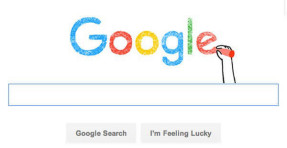
圖一 Google首頁新標誌
Google的新標誌:機動、簡單、友善
新的Google標誌是一個揮手且沒有外框的圖案,作為Behemoth的品牌形象再造。
Google在一個部落格裡利用自己設計的字體–Product Sans寫道:「我們認為我們擷取了Google最棒的部分(簡單、整齊、彩色、友善),我們重塑的不只是現在的Google,更是未來的Google。」
當我們對著Google下指令時,傳統藍色的G會被彩色旋轉的G取代,並會在Google回應時出現彩色的點點。Google叫他們的新設計為集中「群集裝置」的「身分家庭」。
那為甚麼現在要改變呢?「我們利用了原本Google為簡單的筆電瀏覽頁面所設計的的標誌和品牌,更新它使之可以應用於各種的裝置和訊息輸入(例如典籍、打字或講話)。
底線、截線是Google以前碰到的問題。「Google的舊標誌縮小的效果不好」Gizmodo表示,「一個有截線的Google和其他小部分縮小時是很難被清楚閱讀的,G都快要變成C了,l也看起來像i。整體就變成Coogie了!」
除了可伸縮性的挑戰外,原本的字元呈現的是低解析度。Google的設計團隊寫到,使Google更好使用是他們的動力來源。「新的標誌縮小了檔案大小以避免相容性的問題,使我們讓下一個十億個使用者更好用的目標更容易達成。」
這個改變發生在Google整頓成Alphabet時。Alphabet是一個把Google視為子公司並有自己的簡單標誌的新合作控股公司。
「在創立Alphabet的時候,Google的CEO創造的一個新的包含Google在內而非Google監督的生態系統。」Wired說「從很多方面來看,Google的新設計反照出它的母公司。不禁讓人產生出疑惑:這就是Calico、Youtube和所有其他網路的全部嗎?這不會令人驚訝。畢竟,Google的新標誌就是代表這個世界的走向:行動、簡單並在任何地方都可以使用。」
Yahoo、Netflix、Twitter和Snapchat都簡化了他們的標籤以因應手機時代的來臨。
新的主色系G會在許多APP裡被用作偏愛圖標,如Google+, Google Maps等。Wired說「再過一段時間,這個新的G就會變成類似Apple的蘋果標誌,唯一代表企業的標誌。」
With a Google Doodle version of a hand wave gesture, a new serif-free Google logo was revealed as part of the 17-year-old tech behemoth’s rebrand.
Using an in-house created typeface called Product Sans, Google wrote in a blog post, “We think we’ve taken the best of Google (simple, uncluttered, colorful, friendly), and recast it not just for the Google of today, but for the Google of the future.”
A “G” using the logo’s swirling colors replaces the iconic blue “G” while animated colored dots appear in response to a spoken command. Google calls its new features and functionality an “identity family” for a “constellation of devices.”
So why the change now? “We’ve taken the Google logo and branding, which were originally built for a single desktop browser page, and updated them for a world of seamless computing across an endless number of devices and different kinds of inputs (such as tap, type and talk).”
Bottom-line, serifs were a problem. “Google’s old logo did not shrink well,” notes Gizmodo. “A serif-y ‘Google’ with all those nubbins is not going to be readable at small sizes…The G almost turns into a C. The l looks like i. Coogie!”
In addition to a scalability challenge, the original wordmark degraded at low resolution. Making Google more usable for all users was a motivating factor, writes the Google Design team. “The new logo’s reduced file size avoids this workaround and the consistency has tremendous impact when you consider our goal of making Google more accessible and useful to users around the world, including the next billion.”
The change comes as Google reorganizes into Alphabet, the new corporate holding company that now counts Google as a subsidiary and has a slick and simple visual identity of its own.
“In creating Alphabet, Google executives introduced a new ecosystem—one that Google is part of, rather than one Google oversees,” reports Wired. “In many ways, Google’s new design language mirrors its parent company’s, raising the question if this is the future of everything from Calico to Youtube. It wouldn’t be surprising. After all, Google’s new logo is all about where the world is going: mobile, simple and accessible everywhere.”
Yahoo, Netflix, Twitter and Snapchat have also simplified their logos as mobile is fast becoming the internet’s front door.
The new primary-colored capital “G” will be used as a “favicon” with various apps, Google+, Google Maps, etc. “Over time,” adds Wired, “the crisper ‘G’ could become akin to Apple’s apple—the only icon needed to represent the company.”
摘譯自BrandChannel:
http://www.brandchannel.com/2015/09/02/google-logo-090215/
PostedSeptember 2, 2015 by Sheila Shayon


![[圖一] 薯條王 logo](http://www.bpaper.org.tw/wp-content/uploads/2014/04/04-2-1-01.jpg)


![[圖四] 地產大亨](http://www.bpaper.org.tw/wp-content/uploads/2014/04/04-2-4-01.jpg)


